Designing for consistent and transparent EV charging feedback
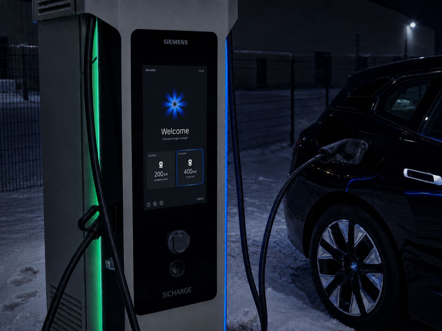
When EV charging slows down, the user is often left guessing. Is the charger underperforming? Is it the car? Is something wrong? Or is this simply expected charging behavior?
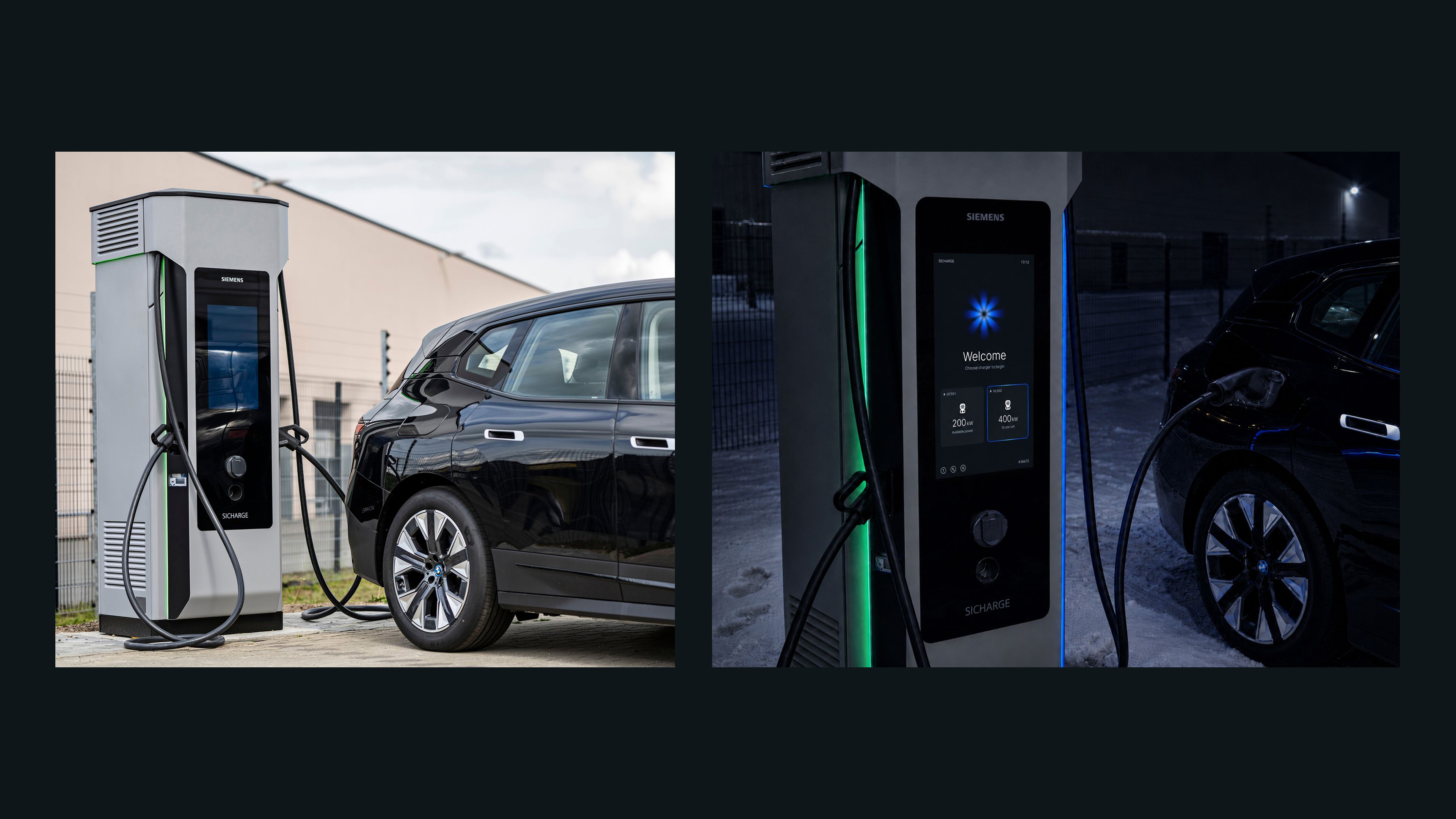
In collaboration with Siemens, we have explored how the invisible charging process can become understandable. We have designed a scalable feedback language for EV charging, starting with the charge point display, but made to extend across mobile follow-up and future touch points.
This project won us the Prize for Material Exploration and Aesthetic Experience at the AHO WORKS AWARDS.
The brief
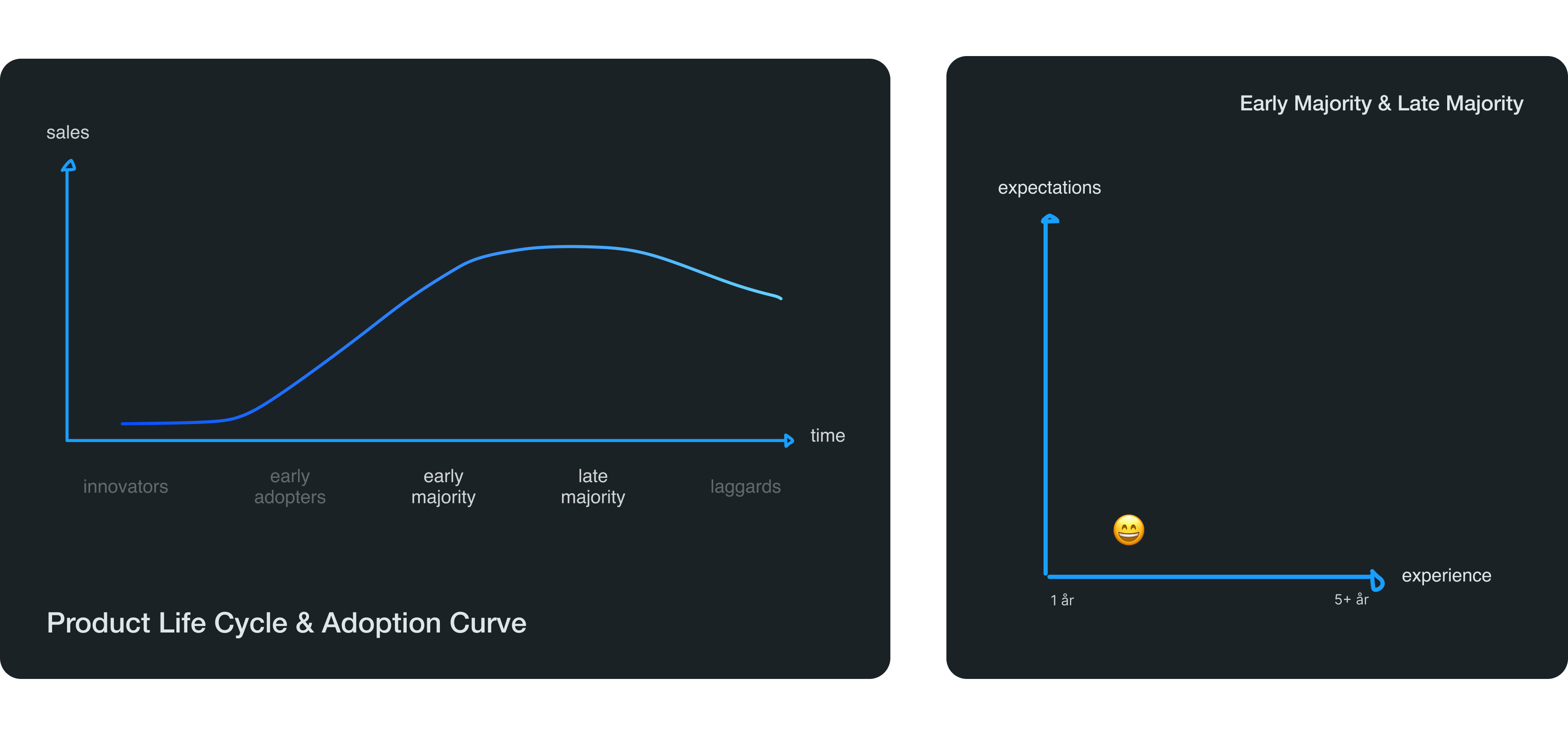
The brief was called “From molecules to electrons. EV charging demystified”. Siemens asked us to explore how we could make EV charging more understandable for the early and late majority users in the product life cycle & adoption curve – meaning people who are just starting to use EV cars.
We defined a user group with 1–3 years experience with electric vehicles. They are not interested in technology, but comfortable using it. And they expect charging to just work.
The challenge
Today, EV chargers display data, but seldom translate it into understanding. The challenge was not a lack of information, but a lack of translation. EV chargers show data, states and numbers, but often fail to explain what they mean for the user, especially when charging speed changes, waiting time increases, or action is required.
The design goal
Our goal then became about turning complex charging behaviour into a format users can understand. So that when the user asks “why is charging slow?”, the system can tell you why in an intuitive and easy way.
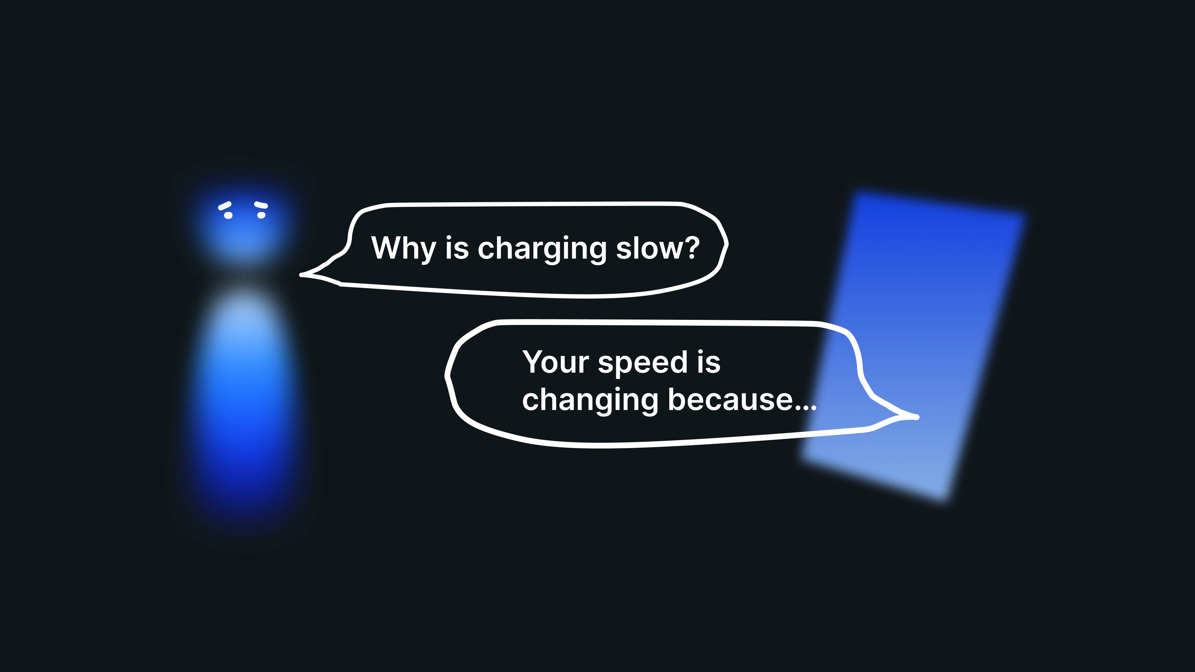
However, this very short and simple question might seem like it should have a simple answer, but when we zoom out, charging speed is not decided by one thing. It can be affected by the car, the battery, site capacity, grid constraints, battery protection logic, operator rules and the current charging context. So a simple question quickly becomes much more complex than most users realize.
The solution
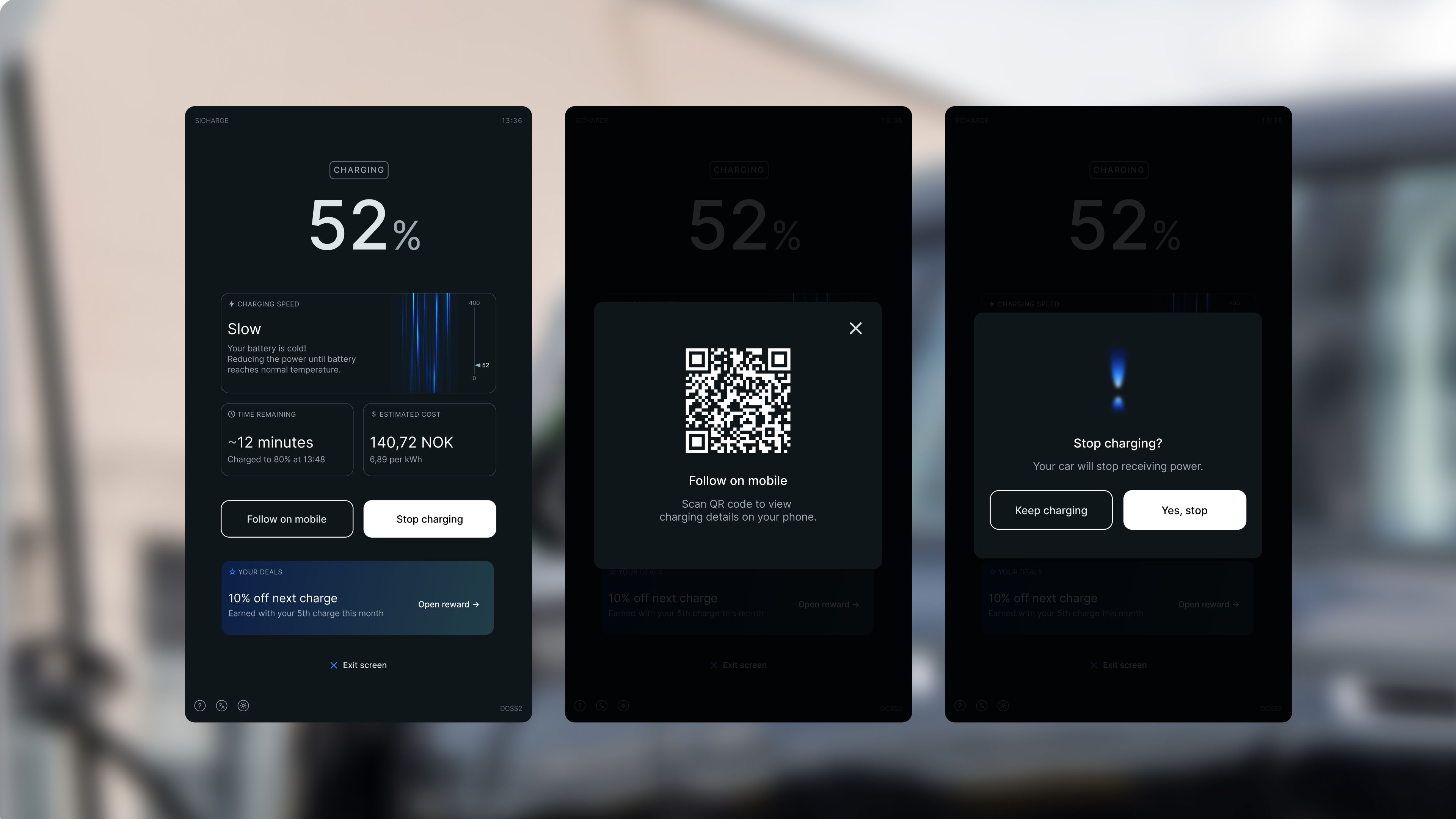
Our solution is a set of components and a visual language for clear and consistent EV charging feedback. Instead of treating the screen a flat surface for information, we have explored how we can use light, rhythm and density as design materials. This became a way to communicate what the system is doing, the current state, and how charging intensity changes over time.
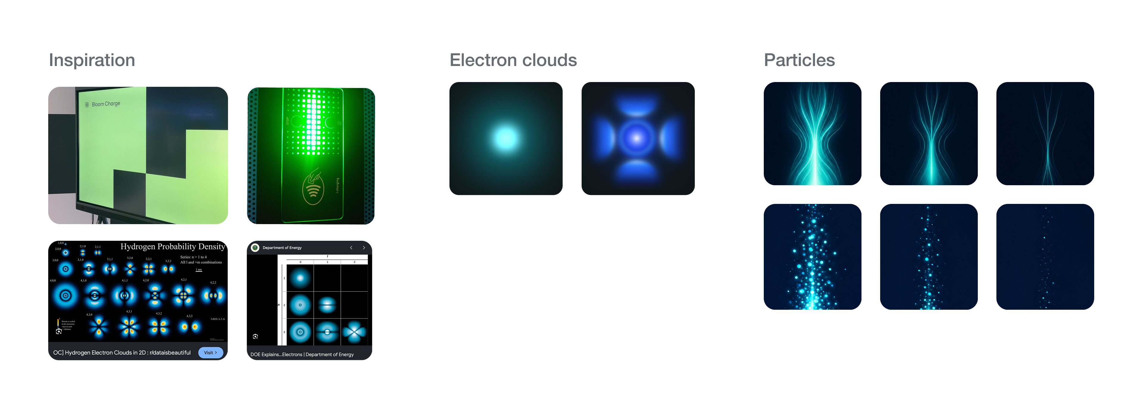
Our visual reference came from electrons, not as a literal scientific simulation, but as a material metaphor for charging behavior. In the starting and preparing phases, the electron cloud represents an active but unresolved state: The car and the charger are communicating, checking and negotiating before energy transfer begins. Once charging starts, this cloud becomes a more directed stream, where density, brightness and rhythm communicate charging power.
The motion is not decoration added on top of the interface. It is a part of the feedback itself, allowing users to sense state and intensity before they have to interpret the numbers – making an invisible technical process feel present, legible and trustworthy.
Alongside this motion language, we have designed the interaction structure around clear states, short explanations, visual hierarchy, timing and transitions. The display guides the user from connection and payment, to charging status, speed and follow-up. Always prioritizing what the user needs to understand in the moment.
Welcome screen
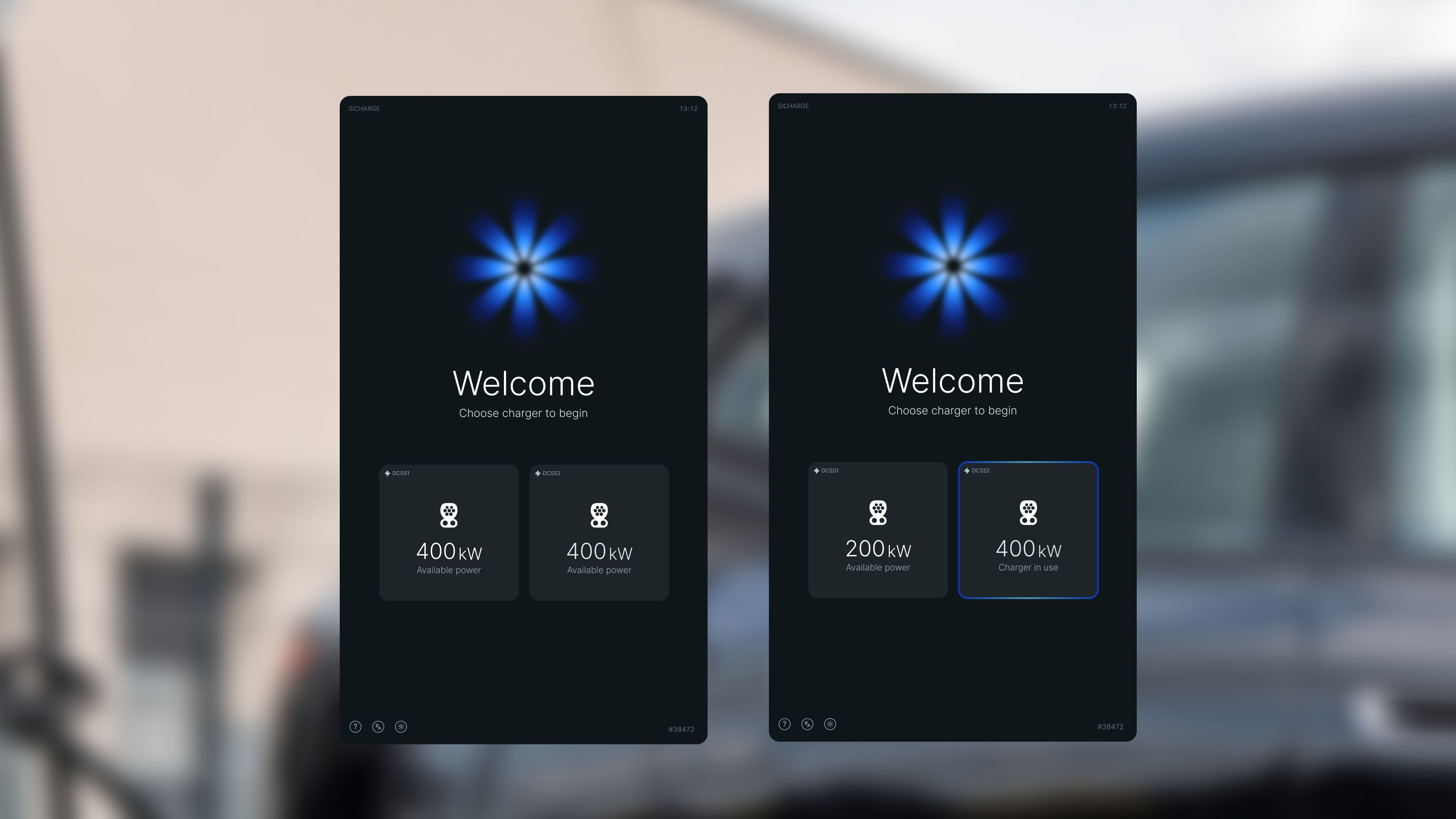
Connecting to charger
Starting charging
During charging
The process
We have developed the project through field observations, user interviews, market analysis, system mapping, prototyping and testing. Across this work, the key insight was consistent: Users did not need more raw data. They needed the system to explain itself in a language most users can understand.
Understanding (week 1-2)
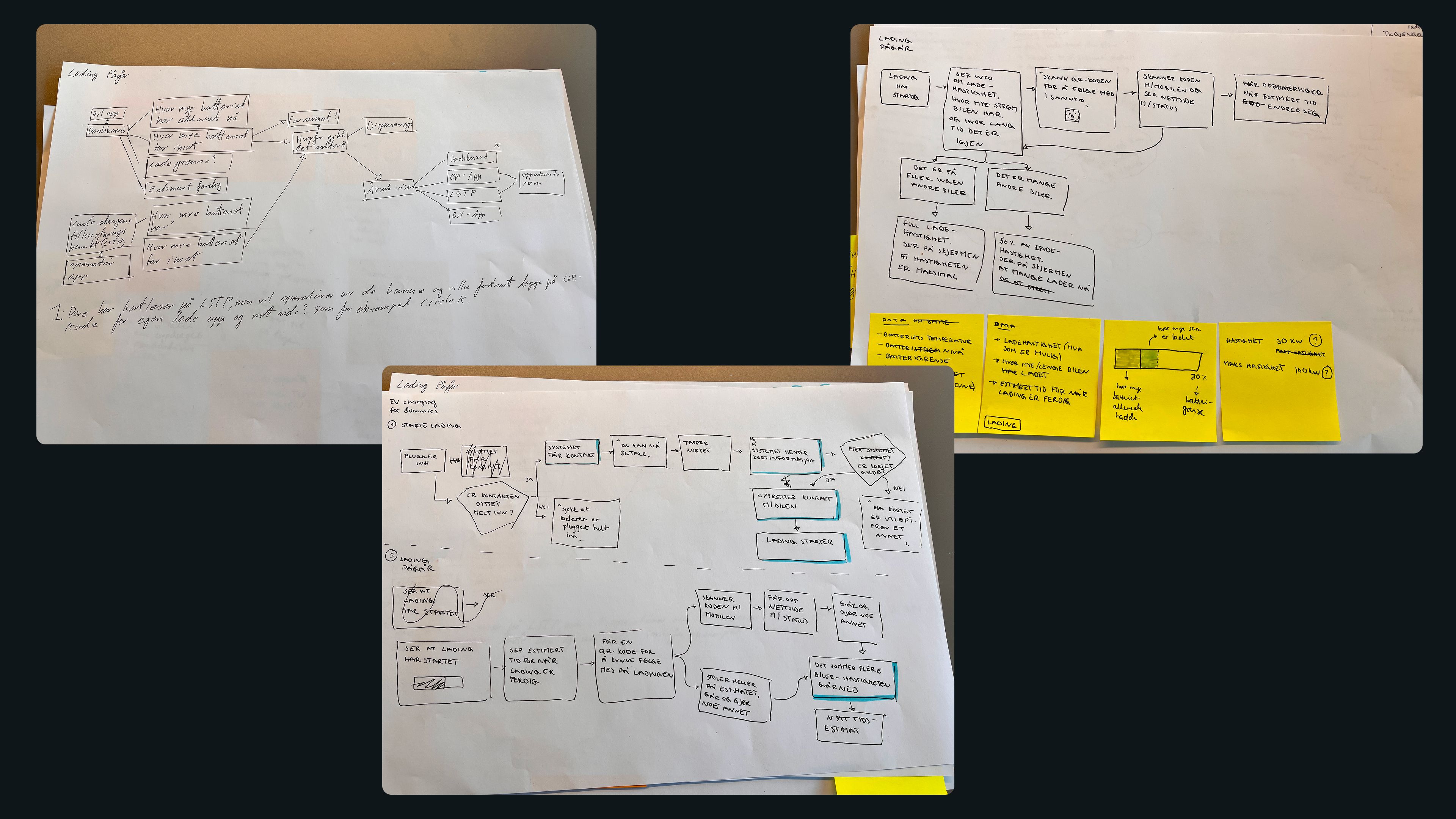
We began by trying to understand EV charging as both an user experience and a technical system. Through market analysis, field observations, existing charger interfaces and user interviews, we mapped how charging status, speed, time, price and user actions are currently communicated. But just as importantly, we mapped what happens behind the interface: how the car, charger, site and operator each hold different parts of the charging process.
This helped us understand where feedback reaches the user, where decisions happen, and where important system behavior becomes invisible.
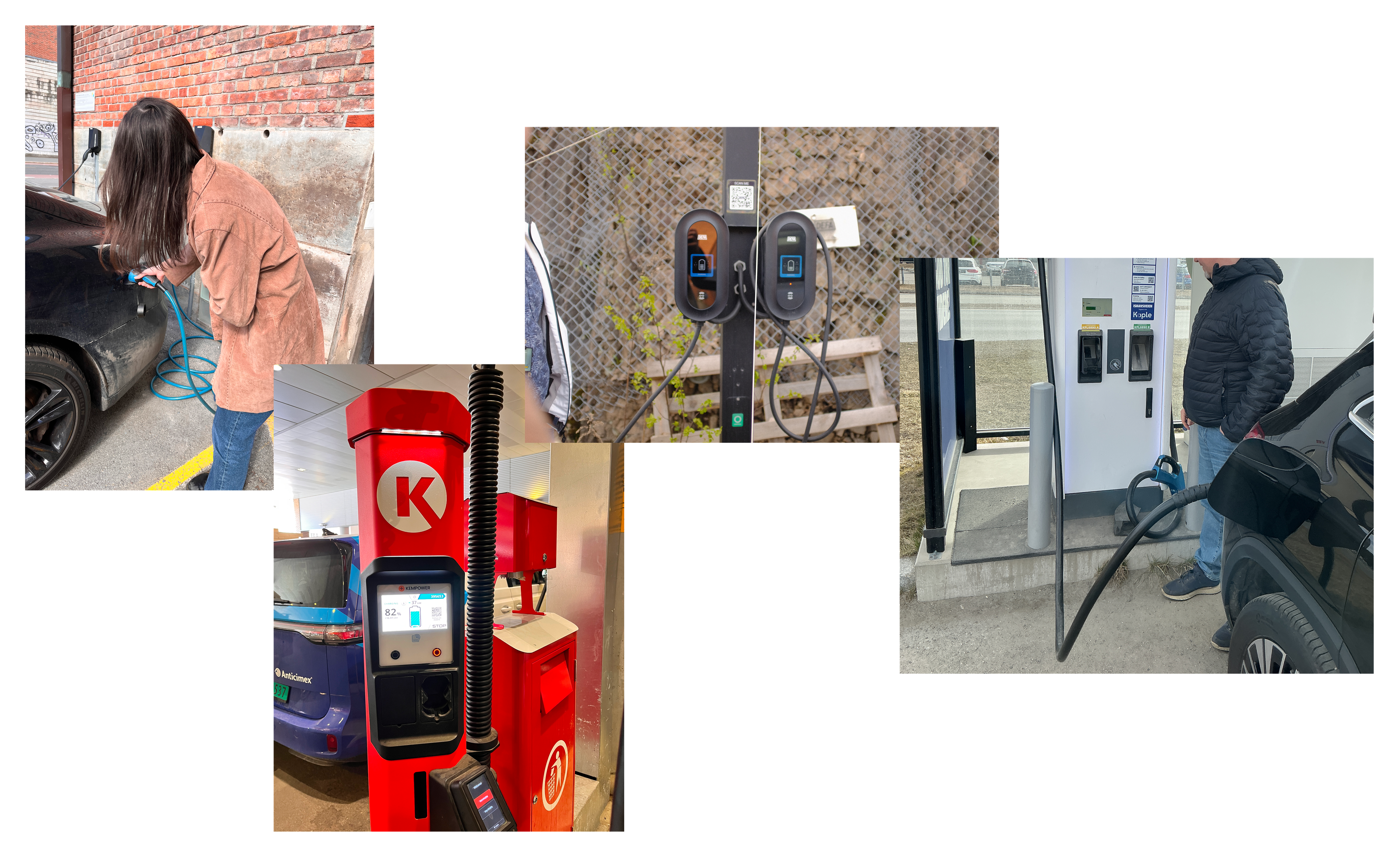

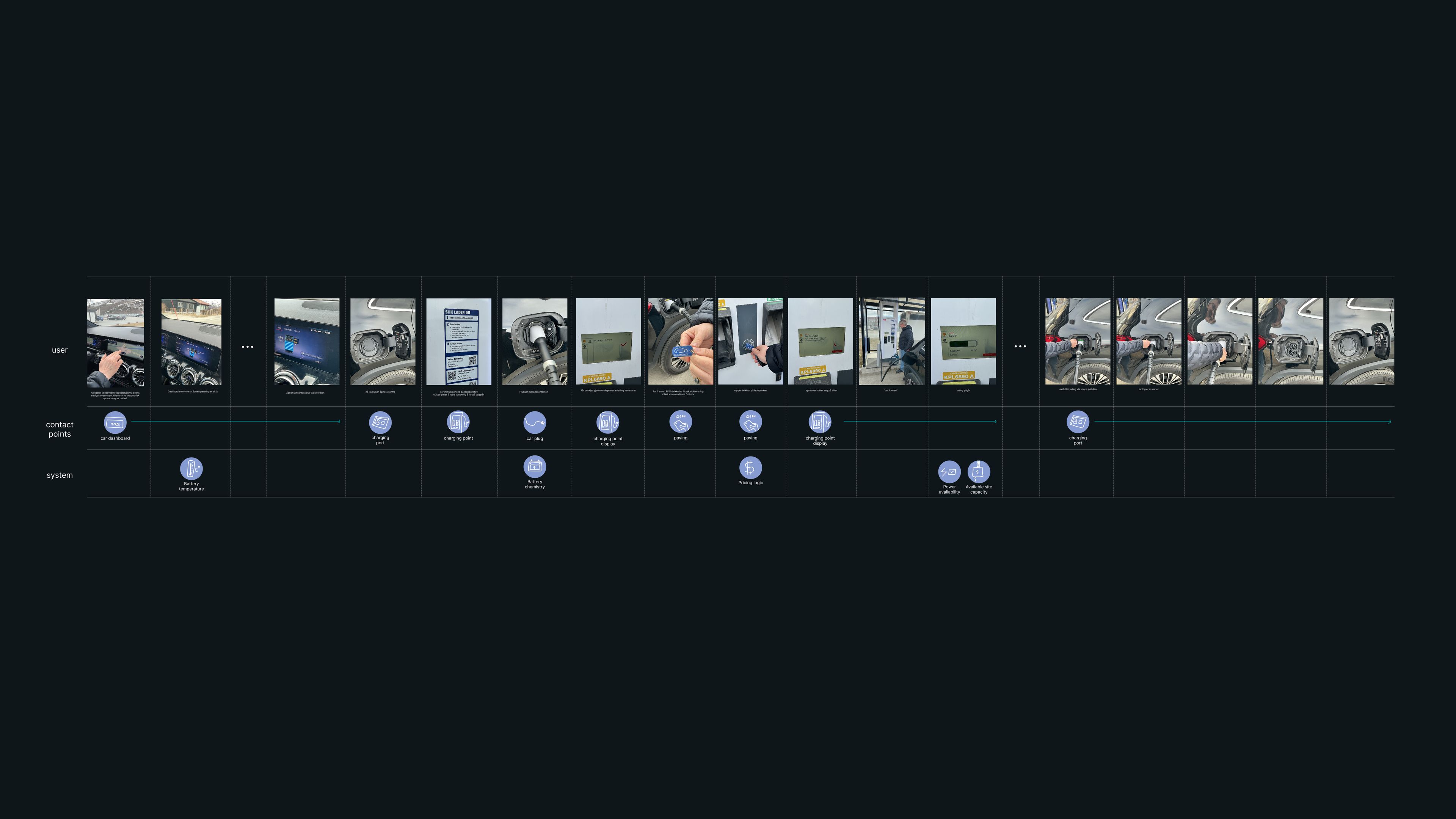
One of our findings was that EV charging still is an information-fragmented system. The car, charger, site, operator and user each hold different parts of the information, while the charge point display often has to communicate with limited access to that full picture.
Exploration (week 3–5)
We created a framework inspired by WCAG’s level-based structure, and used this to define a realistic direction for better charging feedback.
Since charging information is distributed across the car, charger, site and operator, the interface cannot always recommend the right action with confidence. We therefore focused on level 2: Making the available information understandable, useful and trustworthy in the moment.
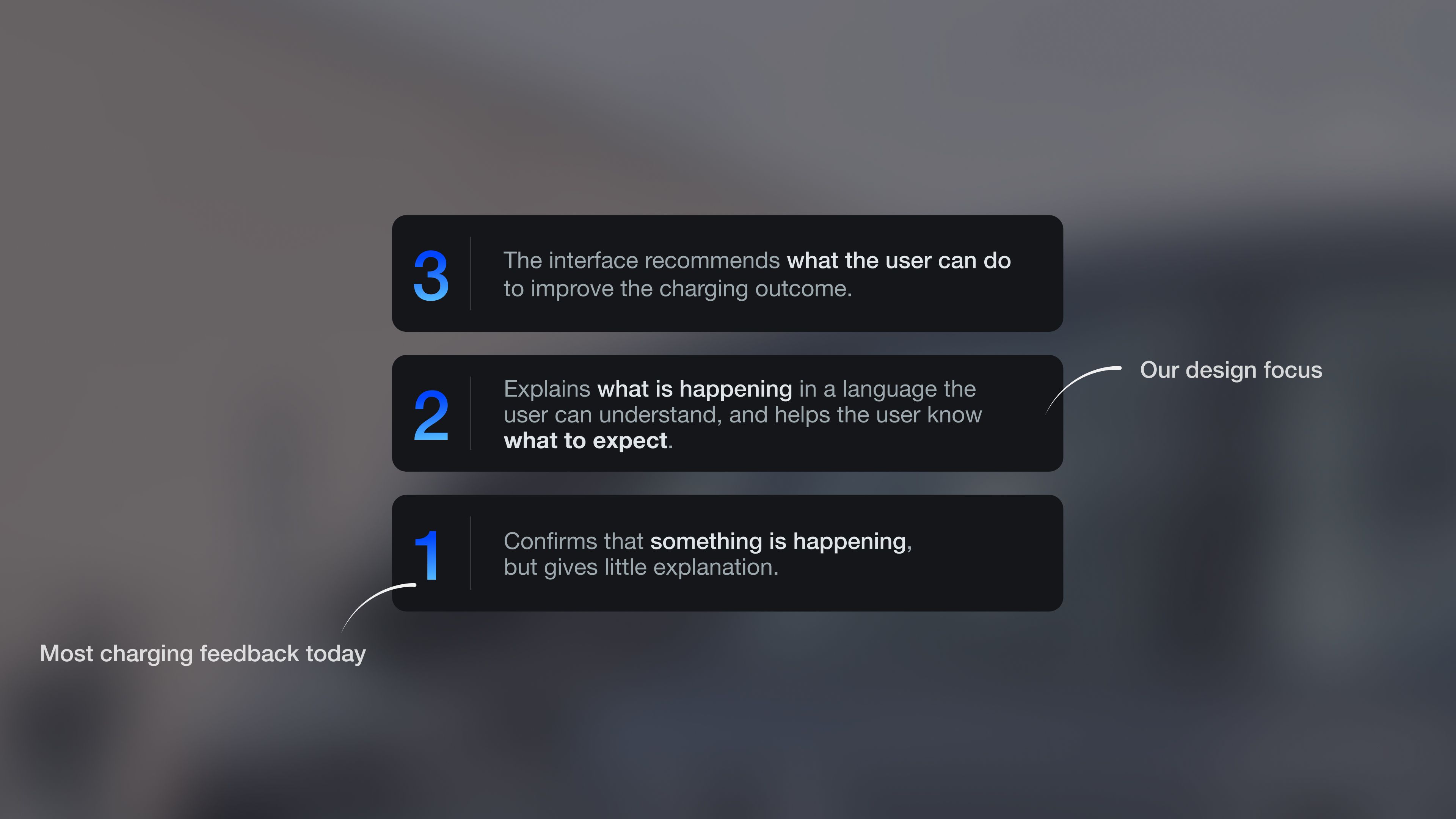
Based on the framework with level 2 as our focus, we explored how we could translate complex charging behavior into feedback the user could read and trust.
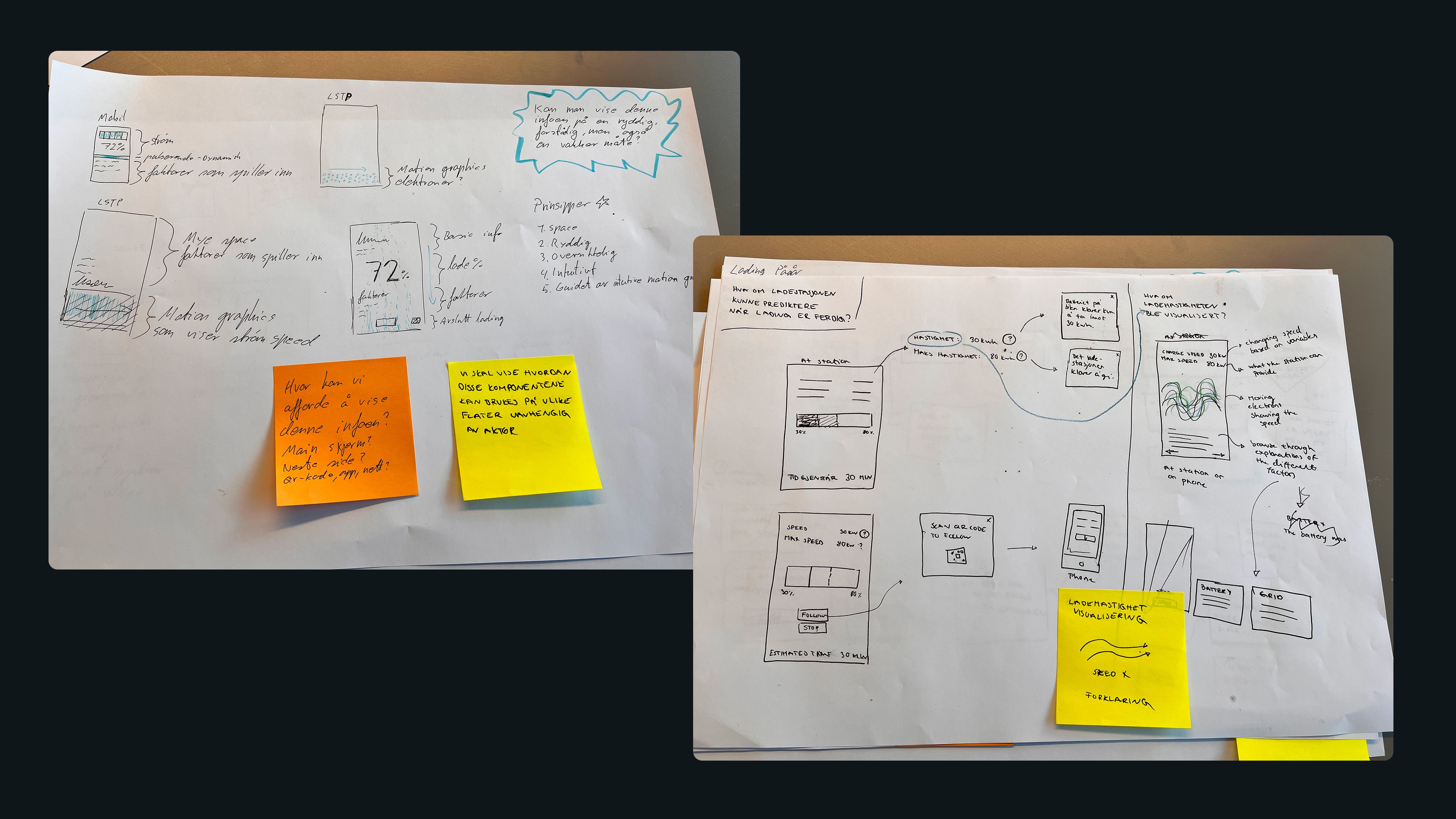
The early ideas focused on turning charging speed into a readable state, using motion to communicate invisible system activity, and pairing technical values with short explanations that clarifies why the system behaves the way it does.
Rather than exposing every technical factor, we worked with the relationship between number, motion and language, where the number gives precision, motion gives an immediate sense of intensity, and text provides the reason behind it. Together, this became the foundation for a consistent charging feedback language.
We explored motion as a feedback layer for communicating invisible system behavior. The visual language needed to feel immediate and alive, but still precise enough to support understanding rather than becoming a decoration.
This led to two motion directions: an electron cloud for system states such as connection and loading, and vertical energy flow for charging speed.
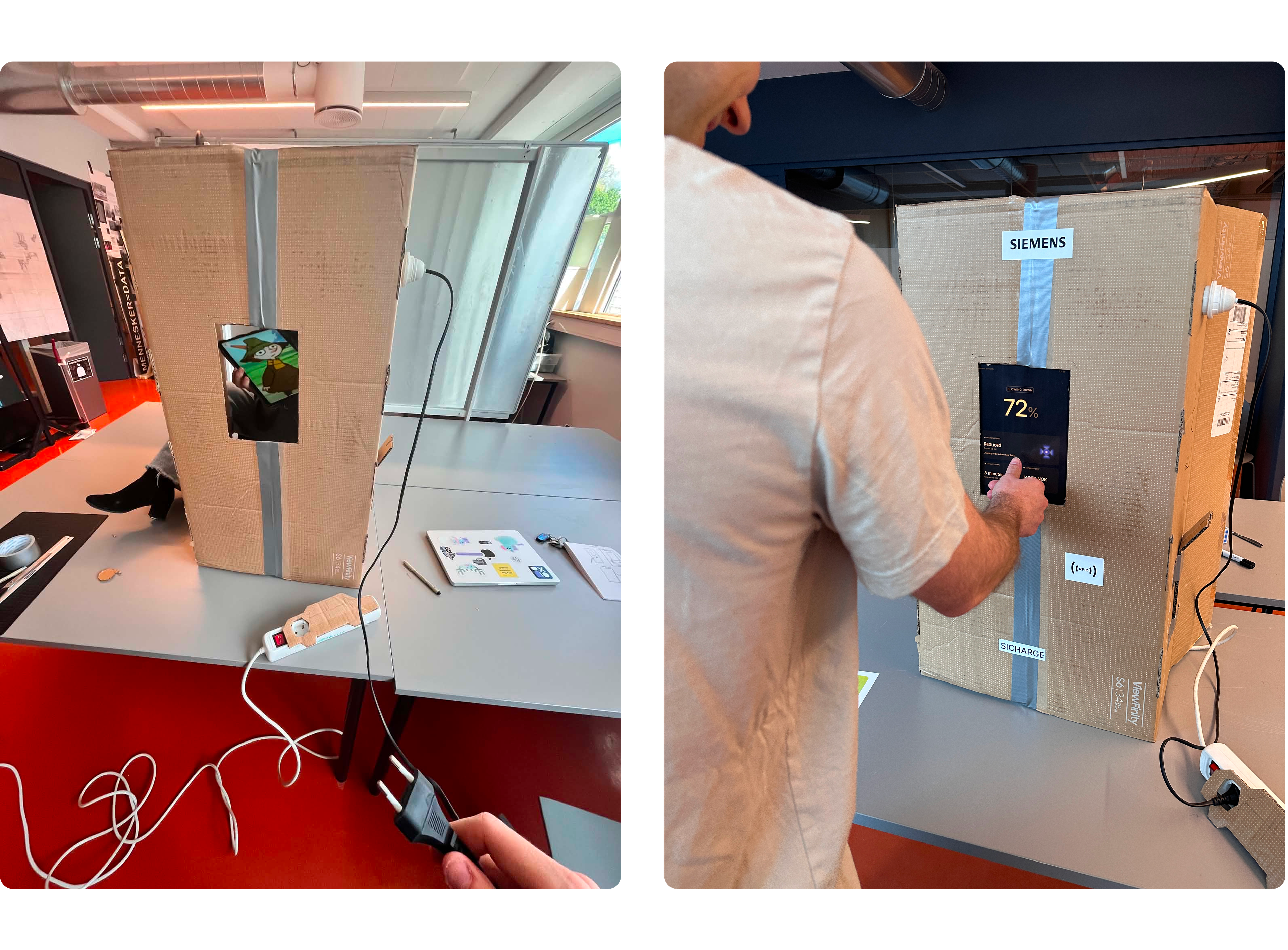
We tested the prototype with 8 users across different levels of EV experience and technical interest. The tests focused on whether users understood the relationship between charging speed, motion, written explanation and available actions – not only whether the interface looked visually appealing.
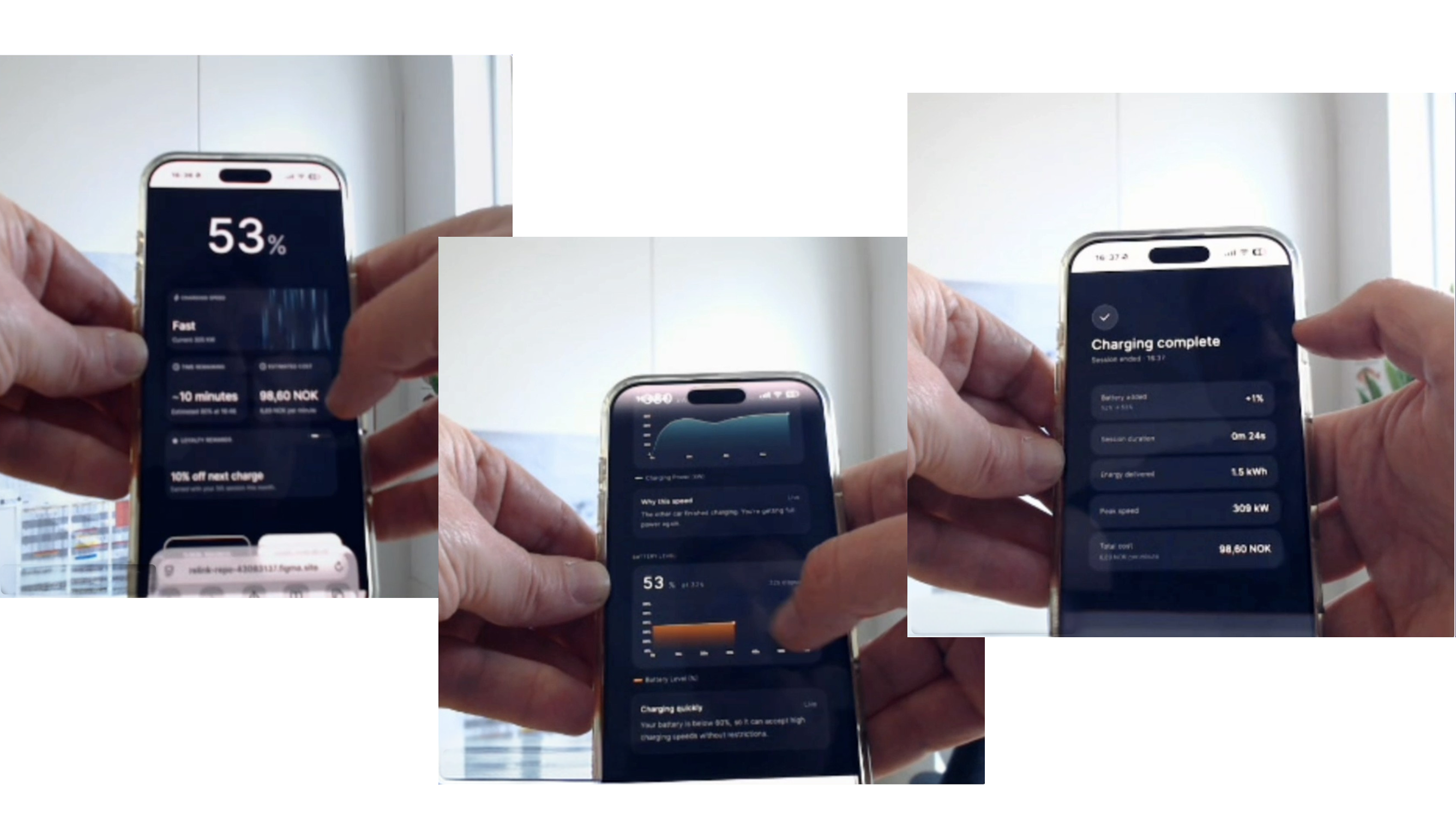
During some tests we used simple design prototypes in Figma (sometimes even just quick sketches), and for other tests we used a working prototype that we developed using generative AI. Below is a recording of a working prototype that Jonas made for one of our final user tests, using Cursor:
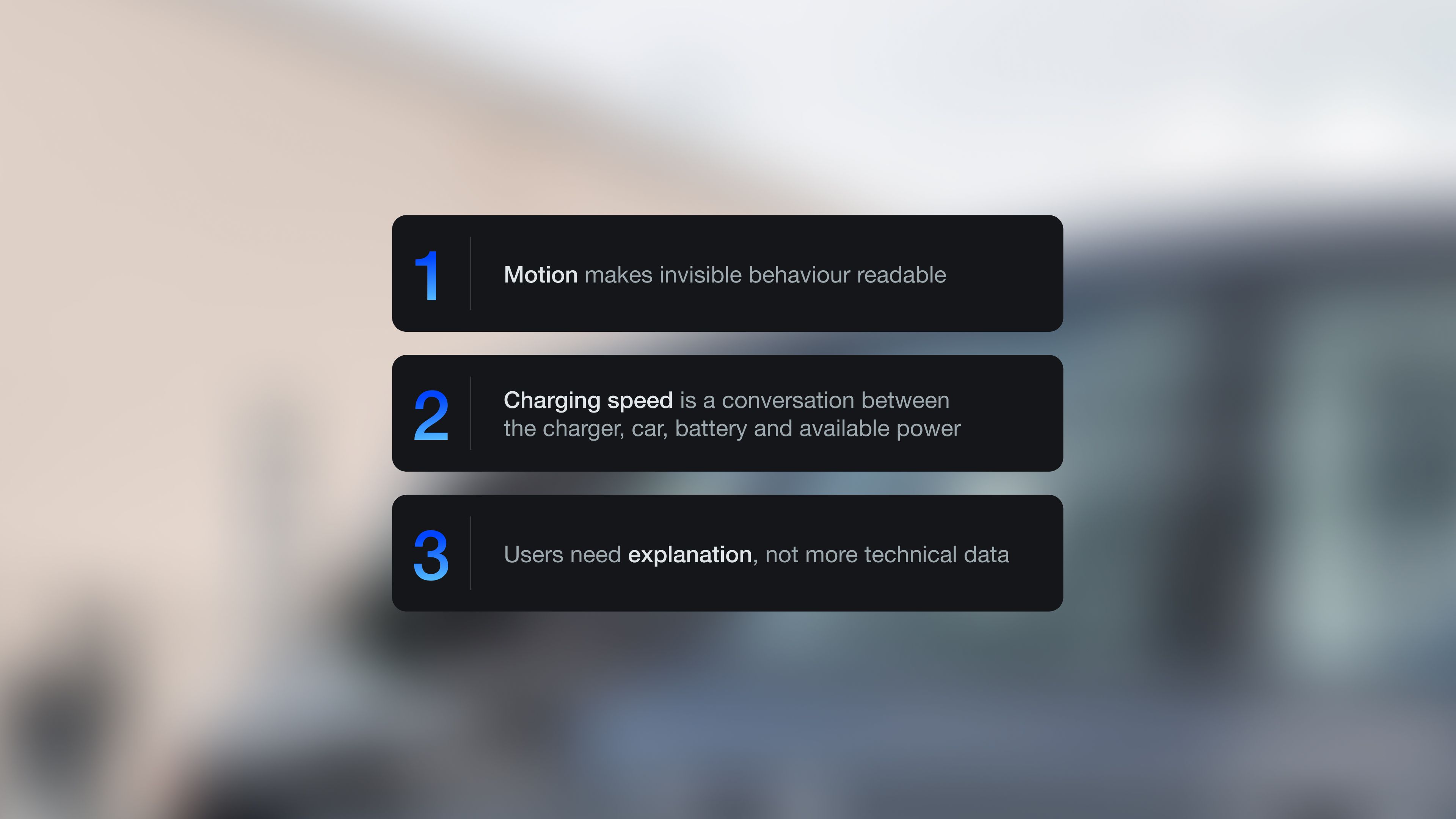
Based on the mapping we did on the charging system and the early user tests, we identified three principles for the final interface: Motion had to make invisible behavior readable, speed had to be explained as conditional, and users needed clearer explanations rather than more technical data.
Iterations (week 5–6)
We iterated across the full feedback language: System states, motion, hierarchy, text, interaction flow and follow-up screens.
In this case study, we are focusing on the charging speed card. It became the clearest example of the core challenge of the project – translating something complicated into something users could read, understand and trust.
In the end we stood between using the particles or a speedometer for visualizing charging speed, but after the final user tests we landed on using the particles. The speed of the moving particles felt more instant, while the speedometer was simply too complicated.
Reflections
For Siemens, the project proposes more than a redesigned charging screen: It proposes the beginning of a standardized interface for public EV charging, one that can work across different operators, locations and charging situations. In a fragmented charging market where all the actors have different systems and interfaces, this project shows how aesthetic quality can become a part of usability.
Collaboration as a team
Jonas and I worked closely throughout the process, and we both had different strengths that complemented each other. Jonas was very efficient and productive as a designer, and drove us to explore lots of different options. I was more detail-oriented and focused on things like visual hierarchy, consistency in spacing and sizing, typography and colors, as well as polishing the design components. I pushed us to build a physical prototype using cardboard to make the user testing more realistic, while Jonas made sure that we made a working prototype using AI as early as possible. Jonas also did the motion exploration, while I gave feedback on things like states and colors.
We had different preferences and working rhythms, but collaborated well because we adapted to each other’s needs. This way we were able to bring out the best in each other.
Read about the project from Jonas’ perspective here →
What I have learned
During this project I have learned the value of using generative AI to make working prototypes based on design prototypes. The weekly presentations throughout the project has helped me practice communicating the design process and design choices in a clear and efficient way. And I have once again experienced how valuable it is to work in pairs as designers when each other’s strengths and weaknesses complement each other.
AI usage
This case study is based on text material written with help from generative AI, and presentation material authored by Jonas and myself. We have collaborated with AI across the entire design process. We have not used generative AI for any of the design choices, or for making design prototypes. We have used generative AI for making working prototypes based on design sketches. We have also used generate AI during motion exploration. Finally, we have used AI to edit the image displaying the welcome screen on the charging station. See comparison with original image below.